Graphic Design is a multi-disciplinary form of visual problem-solving. Before the advent of computers designers used to be technically skilled in a variety of craft-based technologies: letterpress, paste-ups, stat cameras etc. The way layouts, texts, photos and pages were designed was a very mathematical process and still is to this day. The difference is most of this work is taken care of for us and goes on behind the scenes.
Graphic design now is an umbrella term that can be applied across a multitude of job titles: Creative Director, Copywriter, Illustrator, Logo Designer, Package Designer, UX Designer, Web Developer etc. While these unique fields each contain their own bits of technical know-how, what relates them all is the fundamental elements of good design.
The first three we’ll talk about here are Hierarchy, Rhythm, and Space.
Hierarchy
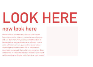
 Hierarchy in design is about the structure of information. Whether it’s a road sign or a magazine advert, good design needs to construct a visual hierarchy. To apply a hierarchy to a design means understanding how you can influence the order in which the eye lands on a design’s elements. What you want is to be able to control the feeling of ‘THIS – then that.’
This is achieved by:
Location – Through reading most people have conditioned their eyes to land on the top-most piece of information they are presented with. After this people tend to follow what has been called an F-Pattern, where the eyes scan left to right, down, and left to right again. In the west we are culturally used to information, particularly text, being structured in this way.
Size/Scale – How BIG something appears in relation to other elements influences its importance in a design and people will typically view elements in their descending order of scale.
Contrast – Contrast in design means visual juxtaposition; elements being compared to another in their state of striking difference. If one particular element in a series is distinctly different from the rest, our eyes will be drawn it by contrast. Contrast can be created with shapes, lines, colour, and even the size of shapes in relation to other elements.
Rhythm
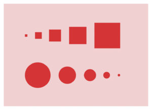
 Rhythm in the language of graphic communication means visual punctuation. You don’t want all the information in a design to happen at once. Much like hierarchy, it needs to follow a visual structure. So, rhythm is the structure of repetition.
Regular – A regular rhythm is a series of repeating elements that are similar in shape, size or colour.
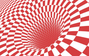
Flowing – A flowing rhythm aims to give a sense of movement through a series of elements.
Progressive – A progressive rhythm aims to give a sense of progression through the repetition of elements.
Thoughtful use of rhythm in design aids the overall uniform. This is true when considering the individual elements applied in specific design collateral, and it’s also true when considering the broader aspects applied to a brand’s identity.
Space
 Good designers understand how to create and utilise space effectively in order to construct meaning in a design.
The importance of whitespace (or negative space) can be compared to the importance of space between notes in a song. If all the notes happened at once the listening experience wouldn’t be too pleasant.
“White space is to be regarded as an active element, not a passive background.” – Jan Tschichold
Space creates layout, form and structure. But space can create also create feelings. For example, a large amount of whitespace applied to a design tends to give a sleek, expensive look; a narrow field of space may make something feel closed-off, and solitary.
 Negative space used in illustrations is always eye-catching when done right. Some of the most successful companies employ this in their logo design.


