When developing your brand identity, the branding logo design is a key component. It’s more important than you think – it might be the very first thing someone sees when they first come across your business, product or service. One of our key mantras is that you don’t get a second chance to make a first impression!
So how do you make sure that first impression counts? Let’s break down the various elements of a great branding logo design and look at what will make it a success.
Give us a KISS.
We love a good acronym. This one comes up a LOT. ‘Keep It Simple, Stupid!’
Great design is like a bad joke – if you have to explain it, it doesn’t work.
Did you hear the one about the font that walked into a bar? “Sorry,” said the barman, “we don’t serve your type here.” Anyway…
The best logos we recognise everyday are the simple ones. Think for example, of the Nike tick, the Apple er… Apple (it all started with a fruit), or the BBC logo. Clean and simple, easily recognised every time you see them, be it on the TV, on social media, even a billboard.
Responsive logo design
You may have heard of the term responsive web design? Basically where the website adjusts to fit different screen sizes such as tablets and mobile phones.
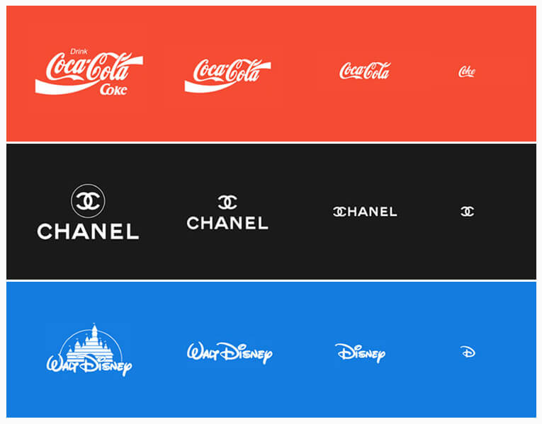
The same principle applies to your branding logo design. Chances are you have a social media app installed on your phone. Look at how Facebook or Twitter show the avatar logo – it’s small and proportionally square as it needs to fit in a circle. Now think for example of an exhibition stand. You have a large wide area where you want to show the logo.
Now you can use the same logo on both if your design permits. But you would find it more beneficial to have say 3 or 4 versions of your logo which can adapt as required.
Take a look at the samples below of some top well known brands. The top versions may be the main logos we know and love, but the other versions are also instantly recognisable.

Colours
Different colours evoke different emotions. And top brands use this to their advantage.
Red (our favourite) as an example is bold and exciting. Green can be seen as representing growth, nature and health. Blue is very much a colour of trust, dependability and strength.
Remember you don’t have to stick with one colour. Most brand guidelines would include a primary and secondary palette for use in indifferent circumstances. Complimentary colours work best – red/green, blue/orange, purple/yellow.
It used to be important that your logo also worked in black and white. Maybe it needed to work well when being photocopied, faxed or printed on an ad in the newspaper. Not as essential these days, but always worth looking at having a monotone version of the design should it need to be printed in a way with limited colours such as screen printing.
Make sure your logo is consistent across RGB and CMYK (told you we love a good acronym). We wrote an in-depth article about colour representation here.
Typefaces
No more bad jokes here, promise.
When it comes to choosing typefaces, make sure that the ones you choose emit the right tone for your brand.
Serif typefaces, such as the widely used Times New Roman, Garamond or Georgia, are of a much more traditional style than a sans serif font like Arial or Helvetica.
In case you are wondering, a serif is a small line or stroke attached to the ends of the larger lines in a letter or symbol. Or more crudely put, decorative stubs on the letters.
Generally speaking, there is a big tendency to use sans serif fonts in logos in modern design. If you are a luxury brand, then perhaps a serif would work for you to provide that high end feel. Sans serif fonts work much better at smaller scale too.
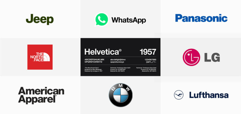
You may have heard of Helvetica? You’ll be amazed by just how many branding logo designs use the Helvetica family.

Handwritten fonts can be a great choice too to give a more creative, artistic, or bespoke feel. Just don’t use Comic Sans. Ever.
Combining fonts can be a great way to add some uniqueness to your design. Careful font pairings can provide a great foundation for your overall brand guidelines, for example you may have a heading font for the main words, and something else for the strap line. These can be echoed when producing any written collateral.
Icons
The icon part of your logo is the part which is more than likely going to be the element which is bespoke to you. Anyone can use the same typeface, but the icon needs to be different, unique, eye catching, simple and clever.
Think Starbucks and how their icon is unique but recognised worldwide. As we mentioned before, Apple and Nike’s icons are extremely successful doing what they need to do. McDonalds M icon (or the Golden Arches as they are known) is another great example of simplicity and uniqueness.
A great article on the Apple logo design here – it all started with a fruit.
Logomarks vs logotypes
You may have heard of either of these when discussing types of logos.
A logomark is a logo which is more pictorial, for example the Twitter bird or the Facebook F mark.
A logotype is one which includes type or words in the design, think Coca Cola or the multi coloured Google logo.
It gets tricky and the lines blurred when brands combine the two. There are no rules as to whether you should have one, the other, or both. Logomarks tend to work better on established brands, so you may find combining the two is a great option.
Conclusion
Do:
- Keep it simple
- Use a simple relevant colour palette
- Consider how it works in all sizes
- Choose the right typefaces (no more than two in the design)
- Be different to your competitors – don’t just blend in
- Be creative and unique
Don’t:
- Use stock imagery/icons
- Use more than 3 typefaces
- Use colours which clash
- Copy
- Overcomplicate
For further reading take a look at our article on branding for business If you would like to chat to our team of experts on how we can help with your branding logo design, get in touch today to see how we can help make that first impression count.


