We often get asked about branding guidelines and if clients need them. Our answer is simple – yes! No matter how large or small the business, they are an essential part of building your brand.
Branding guidelines can vary dramatically in size and complexity, but they play a crucial role in ensuring your brand is represented consistently and accurately each and every time.
When we recognise a brand, it’s as a result of successful brand guidelines. Successful branding guidelines build that consistency across all visual and written communications a brand creates.
Who are they for?
Also commonly known as your “brand standards”, “style guide” or “brand book”, the guidelines include information on your brand and how it should be portrayed, visually and in tone of language/voice.
It is for the company employees and service providers or partners to follow if they are producing any form of communications for the brand.
For example they may include details on fonts and colours to use graphically, or tone of voice to follow in written communication. They often focus on the correct use of the company logo and its associated assets.
Think for example of all the different places your brand or company may be seen. You have your website, your social media channels, your printed marketing materials (such as a brochure or exhibition stand), perhaps even something like the office signage, then the team business cards or email signatures.
ALL of these need to be consistent and be reading off the same page. The guidelines become a great asset for creating consistent, on-brand content each and every time. It helps with bringing your team onboard with what you are trying to achieve.
What should my brand guidelines include?
Brand guidelines can include several different sections. They can vary in size dramatically, from a single page document, to extensive books with multiple chapters.
Sections inside can often include (but not limited to):
- Company history – an overview of the brand history and its timeline. This helps to provide context and reinforce the strategy.
- Vision – what is the brand trying to achieve? What is it’s ultimate objectives?
- Values – the pointers on the compass which directs your brand. The values are there for the employees to live by and your clients to embrace.
- Logo use – how your branding logo design should be represented, looking at spacing, sizing, colours, proportions.
- Typography – fonts to use and the associated settings, such as kerning and leading.
- Colours – references for your brand’s colour palette. It’s often the case a range of references are supplied such as CMYK (for print), RGB (for screen) or Pantone (also for print).
- Imagery – style and tone of photographic or illustrative images to use, ensuring consistency.
Examples of successful branding guidelines
Here are some examples from top household names both new and old. The fia le excursion of the guides varies as you will see. Traditionally they would come in a printed format, but modern brands often dedicate small micro sites to providing the standards.
1 Spotify
https://developer.spotify.com/branding-guidelines/
With a focus on the famous green icon, these guidelines show how you should and shouldn’t use the logo.

Things such as spacing, sizing and proportions are displayed, as well as showing how the icon can be used alone, but the word mark must always be accompanied by the icon.
Simple rules may seem unnecessary to some, but the detail in consistent representation is what makes it a success.
2 Nasa
https://www.nasa.gov/sites/default/files/atoms/files/nasa_graphics_manual_nhb_1430-2_jan_1976.pdf
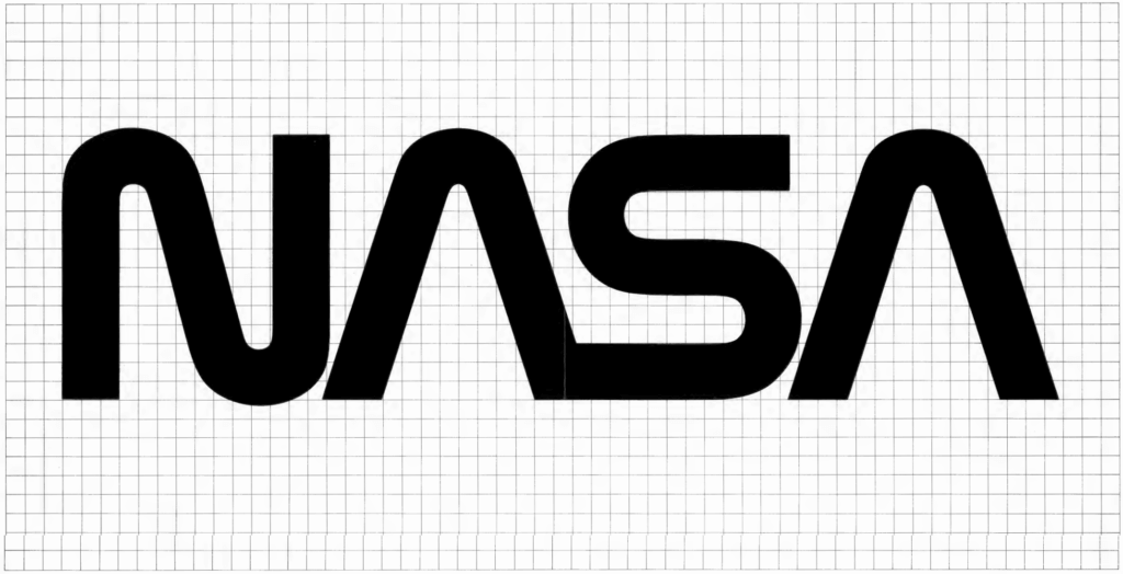
The NASA branding guidelines manual from 1976 is a whopping 60 pages.

Press kits, posters, magazine and book covers, the manuals provides guidelines on a wide range of executions.
The guidelines have provided so iconic that books have been written about them.
3 Uber
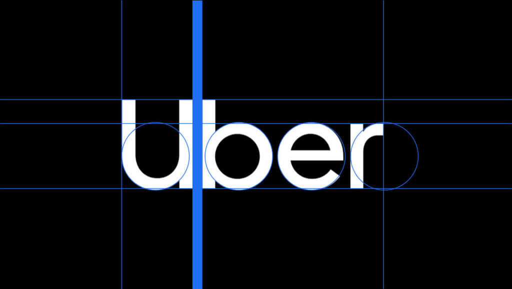
These extensive digital guidelines provide a range of accessible guidelines for its fleet of members.

It’s guidelines cover 9 key areas, logo, color, composition, iconography, illustration, motion, photography, tone of voice, and typography, and comes with a list of top requested assets.
You can also find links to the brand story and an faq/help section.
4 British rail
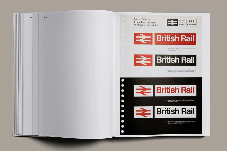
Another historically important set of guidelines, British Rail created an extensive corporate identity guide back in 1968. Now regarded as a significant part of British design history.
Recently various sections of the guidelines have been collated into a book you can buy here.

It includes details on correctly using the famous double arrow icon and logo mark.
5 Netflix
https://brand.netflix.com/en/assets/
Again some digitised brand guidelines for a digital brand.
Quite a simple set of guidelines showing what you must and mustn’t do with the logo.

The simple clean logo is so easily recogniseable, in its full form or just as the N.
Tips for creating your own brand guidelines
A good place to start is to plan out what you need. Think ahead to who may need to use them and what they need to know.
As a bare minimum, you should show how to use the logo, and the associated typefaces and colour palette. This will ensure that the visual representations of the logo are consistent.
Next think about your story and voice. Do you want to encourage a particular way of speaking? Are there certain adjectives or phrases that you regularly use?
99designs suggest that there are 6 key elements to a good set of brand guidelines:
Conclusion
They may seem overkill for a small business, but don’t underestimate the importance of well thought out and considered guidelines. Your brand isn’t just a logo. Your brand is your voice and now people perceive you, and good guidelines will ensure that has the best possible chance of being a success.
Get in touch with our team of branding experts today to see how we can help give your company the very best foundations from which to grow in the modern multi-media age.


