The challenge
Sagal believe that the workplace should make you smile, it should inspire to be great and most of all offer comfort and function to you the user.
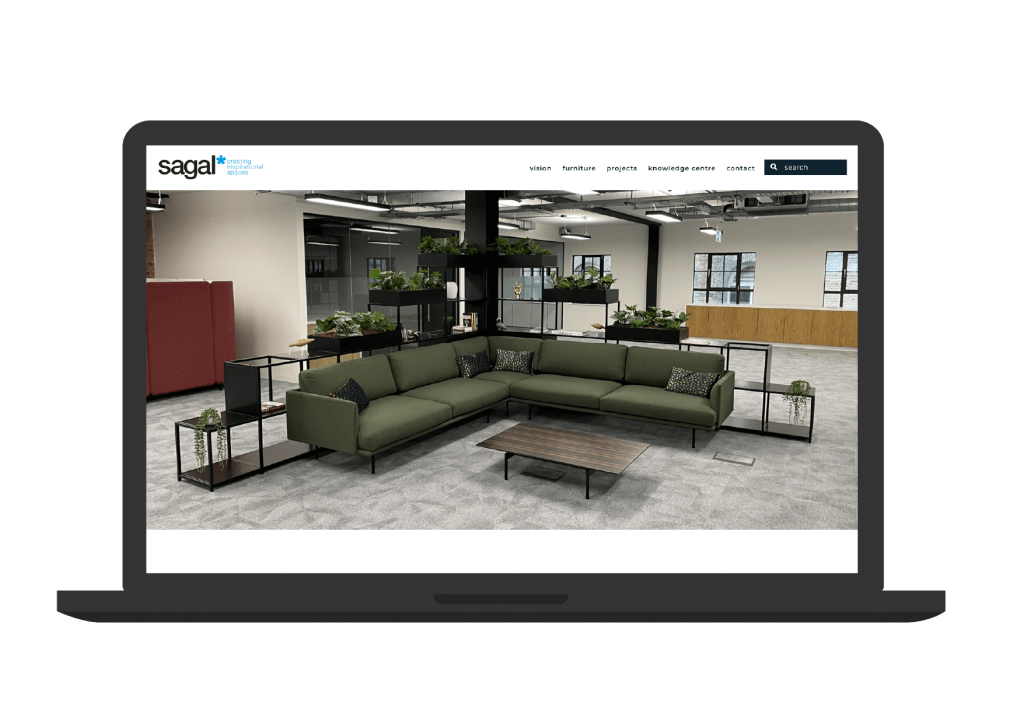
Red Sentence were approached by Sagal to assist in creating a new user friendly website, which not only showcased the fantastic range of office furniture products they provide, but established them as a leader within the workplace industry.
The solution
One of the main issues with their previous website existed around the complicated way in which the furniture catalogue was structured. Multiple URLS and complex navigation had made finding products challenging.
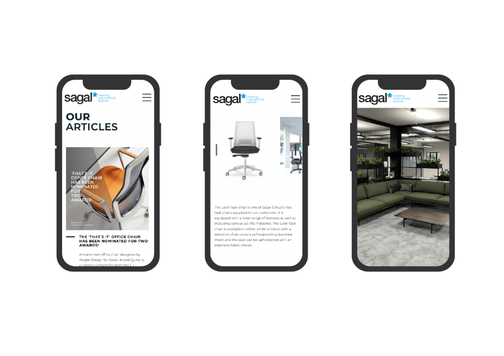
In the new website we implemented a couple of different mechanisms to help users navigate the product pages. These included a simple search feature, and also a filterable list of products which let users choose items through furniture type and workplace zone with just a couple of clicks.
The products were almost secondary to the need for the website to emphasise Sagal’s knowledge and expertise surrounding the modern workplace.
To aid these we incorporated knowledge base and inspiration sections which are regularly updated.
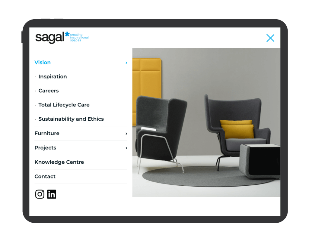
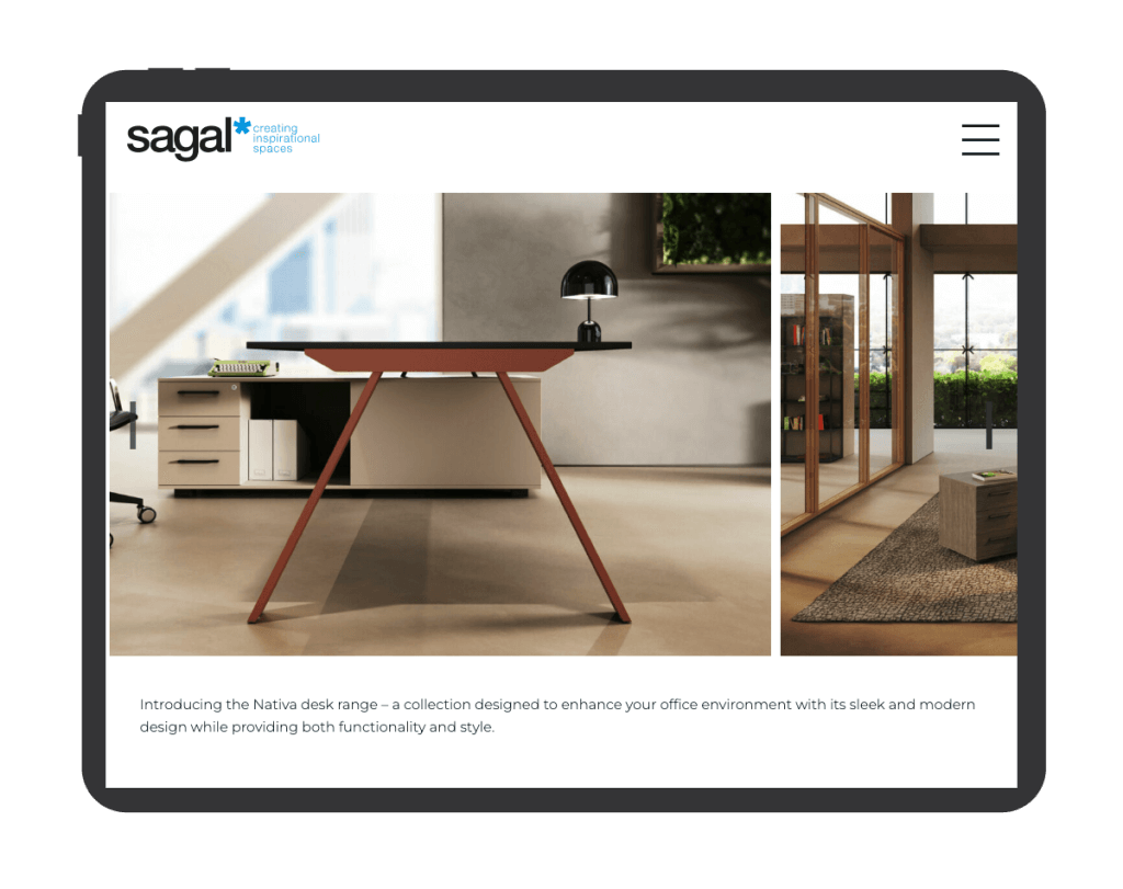
The outcome is a clean modern design, with simplified navigation, which makes use of Sagal’s fantastic library of photos and content.
I highly recommend Red Sentence for their outstanding work on our Sagal Group website. Their expertise, professionalism, and attention to detail exceeded our expectations. The team understood our vision, provided creative input, and delivered a visually stunning and user-friendly website. Communication was excellent and continues to be so! Their technical proficiency and commitment to quality make Red Sentence an invaluable web development partner. We are thrilled with the results and look forward to future collaborations.
Natalie, Creative Director
