The challenge
CloudTech24 provide a range of IT support and cyber security services. They have offices all over the world but are headquartered in the UK.
They had a particular challenge in that they needed to merge 2 websites together under single new branding. The new merged sites needed to consolidate and combine content, whilst maintaining good SEO.

The solution
Before working on the website we explored various new concepts for their new visual identity.
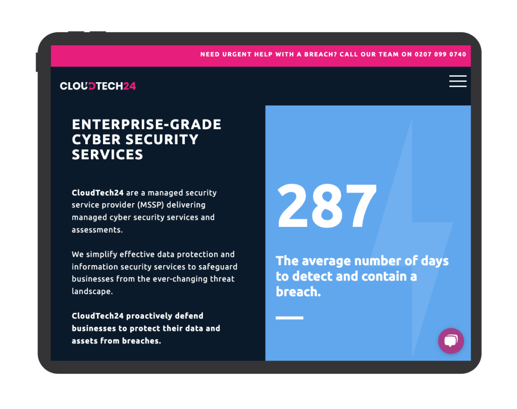
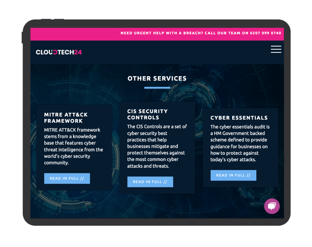
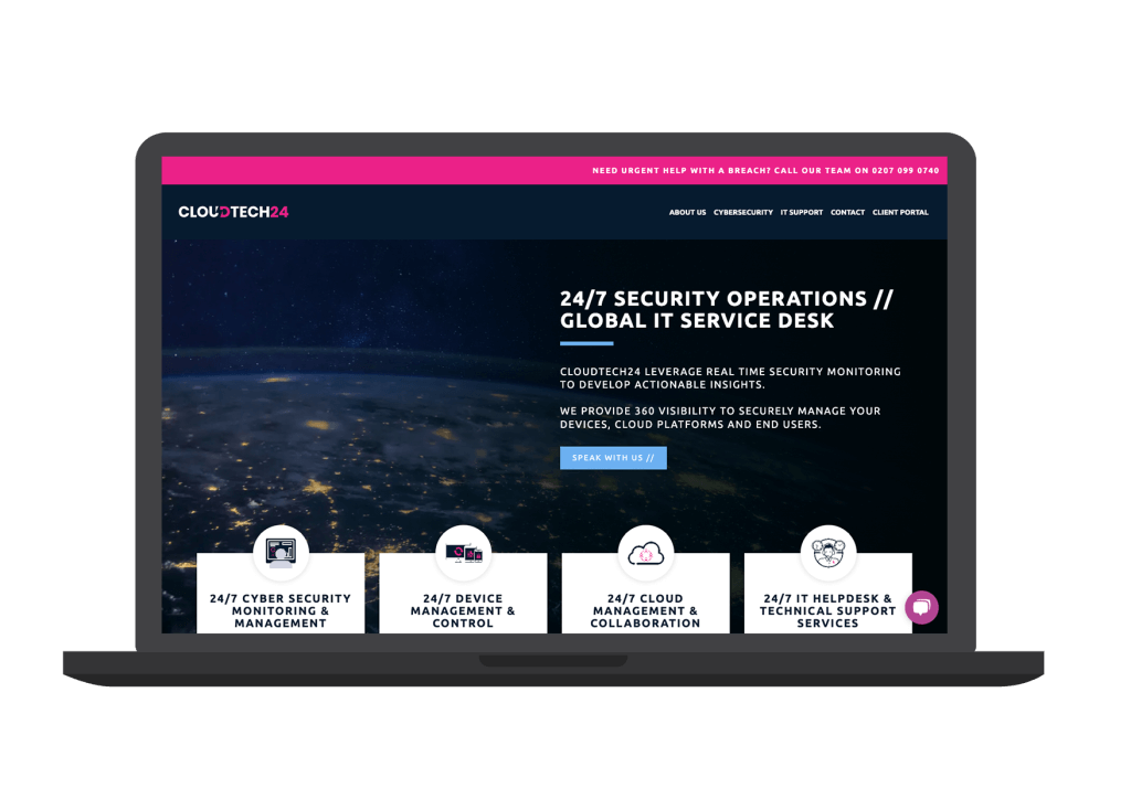
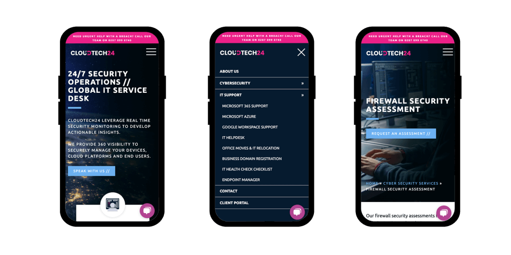
Previously their main website used mostly light blues and whites, common within the IT industry. To help differentiate CT24 in the marketplace we proposed some bolder approaches to the use of colour incorporating dark blues and pink as the primary colours.
The two previous websites both had a vast library of optimised content, focused around their key service offerings and also the blogs.
We worked alongside their in house marketing and content team to make sure the merged sites followed the best practices to maintain a good presence in the search engines, using clean semantic code to create the templates and incorporating things such as schema FAQ blocks and breadcrumb navigation where the structure was layered.
The scope
- Brand identity design
- UX design
- UI design
- Website development
The results
- Unique new brand identity
- Simplified content management system making full use of the WordPress native Gutenburg editor
- Merged and migrated content editable within a single CMS
