The challenge
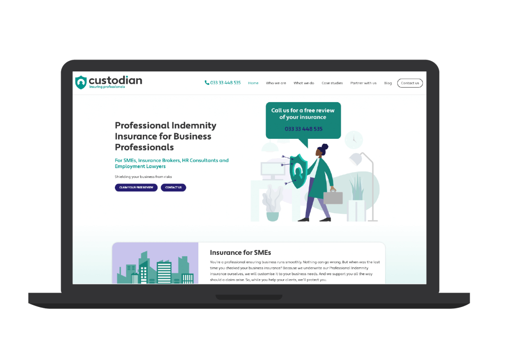
With a website and visual identity in need of modernisation and refreshing, we worked with Custodian Insurance to firstly create a more professional visual identity and brand guidelines. Once this was in place, we designed and developed a new website.
With their target audience being a mix of SMEs, brokers and HR specialists, the new website needed to provide easily accessible information to each.
The solution
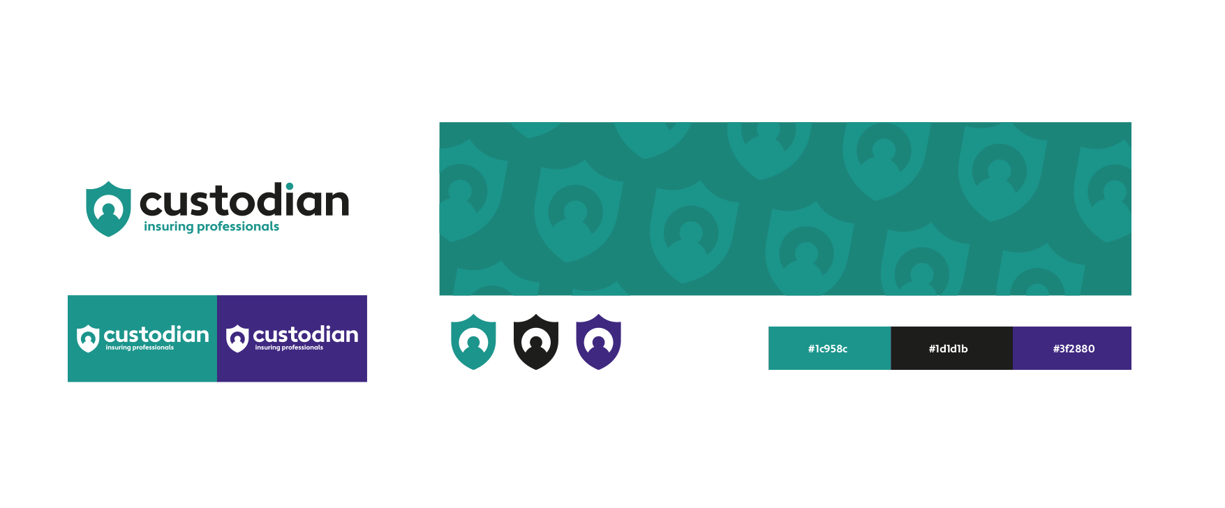
With the new branding, we created a design which would included a standalone icon and also the full logo type. The final design was clean, professional and had a hint of the colours used previously as a nod to the older identity and business roots.
The standalone icon could be used as a social media profile logo. We wanted to ensure that the new brand appeared consistently across all media.
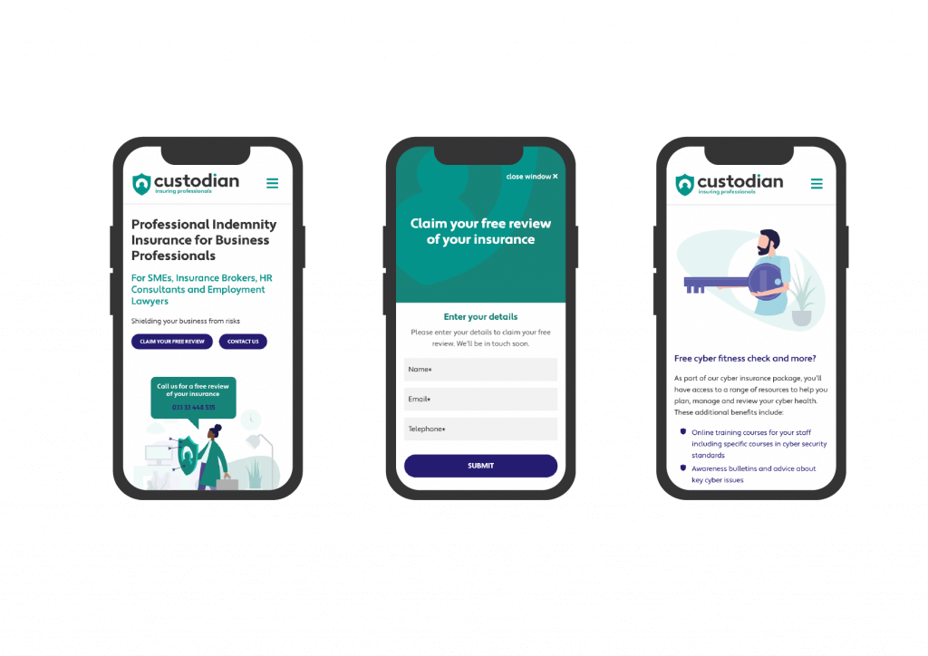
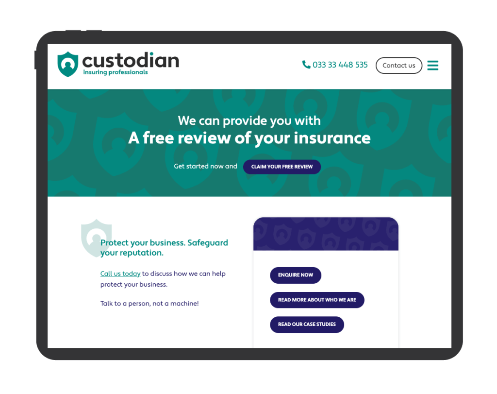
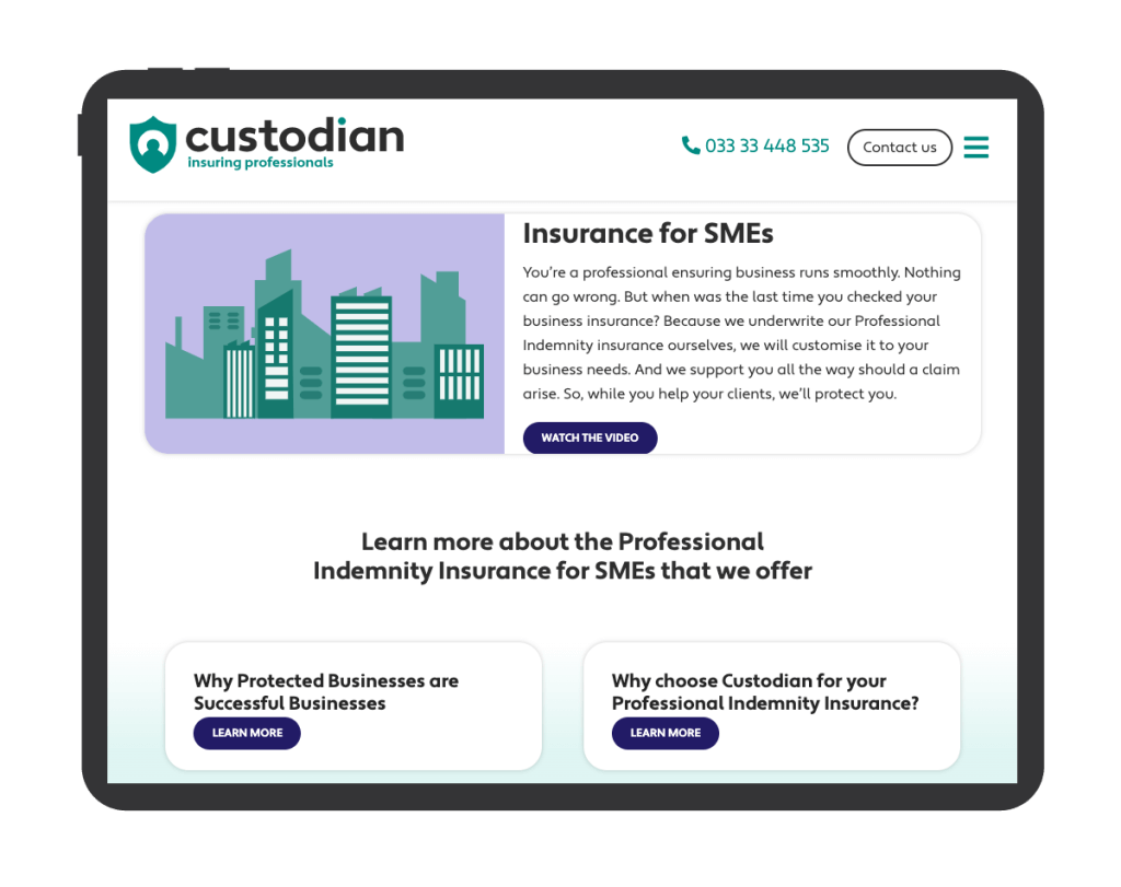
With the website, we took a more illustrative approach to the design. Combining a mix of some stock illustrations along with our own custom variations, we created a new design which was modern and relevant.
The icon from the new identity worked well as a repeat pattern in some sections.
The key service pages were reinforced by links to common FAQs as well as testimonials and information on making claims.
As well as providing helpful information on their service offering, the new website needed a means of capturing data from potential customers. A free insurance review offer was used as a tool to help this.
The scope
- Brand identity design
- UX design
- UI design
- Website development
The results
- 30% decrease in average bounce rate
- 15% increase in average session duration
- Improved focus on CTAs and lead generation
Comparing data over a 30 day period year on year after launch.
Patient, efficient and creative. Excellent from start to finish.
Zahid, Director


